Iron Timber
A beat-up logo for a custom furniture company
-
View Commentary
Creating aesthetically pleasing custom furniture out of solid wood and welded iron is what this shop loves to do. Their logo melds those textures into a form that represents them and their artwork.
Hands & Feet
An identity for a mobile app that challenges users to do good deeds
-
View Commentary
Being the "hands and feet" of Jesus is what this mobile application challenges its users. The identity is bold, reaching out of itself and into the world around it.
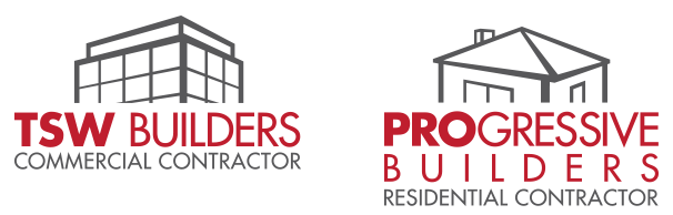
TSW/Progressive Builders
Create a pair of logos for the residential and commercial sides of a builder.
-
View Commentary
Uniting two divisions together through a visual communication system that is shared, these two logos represent the building process through their unique perspectives and their simplified architectural type renderings.
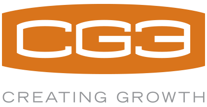
CG3 Consulting
A consulting company needed a memorable, bold mark.
-
View Commentary
CG3 is all about "Creating Growth", and their mark needed to visually show the results that it could bring to its customers. It does this through a custom designed typeface as well as a dynamic shape bursting at its seams.
McIntyre Library
UW Eau Claire's College Library needed a visual identity for itself
-
View Commentary
Libraries have an identity problem, everyone assumes they're about books. McIntyre wanted to realign itself to the digital world around it, showing its many digital resources it could offer students interlocking and working together.

Leadership Development Group
Helping organizations identify their leaders and make them even better.
-
View Commentary
The identity worked to show the process of choosing people within an organization and training them. The end goal being that the organization aligns itself to its goals and functions as a cohesive whole.
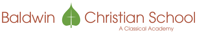
Baldwin Christian School
The school has its roots set deep in its beliefs
-
View Commentary
The leaf mark represents the learning and growth that happens at the school, and how Christ is at the center, within the roots, of the whole organization.
iEDGE
An identity for the next generation of Navigator missionaries
-
View Commentary
iEDGE is a program for teams of young missionaries who commit to live in a country while sharing their faith. The compass communicates directionality and orientation while the globe in the center communicates their intentionality and strategy around the world. The outward arrows show expansion and growth of the gospel.